Designing the Metro Rail Experience
The App That Didn’t Exist So I Designed It. A UX case study to connect millions of commuters with a smarter, seamless travel system.
How It All Started
It began like many design journeys, with frustration. I stood at a metro gate, card in hand, unsure of what was my last balance. No balance check. No notification. No time to ask for help.
That moment turned into curiosity. Curiosity became a question: “Why hasn’t anyone designed this experience yet?” I started this case study to imagine what a metro app could truly be.
The Problem Wasn’t the Train, It Was the Experience
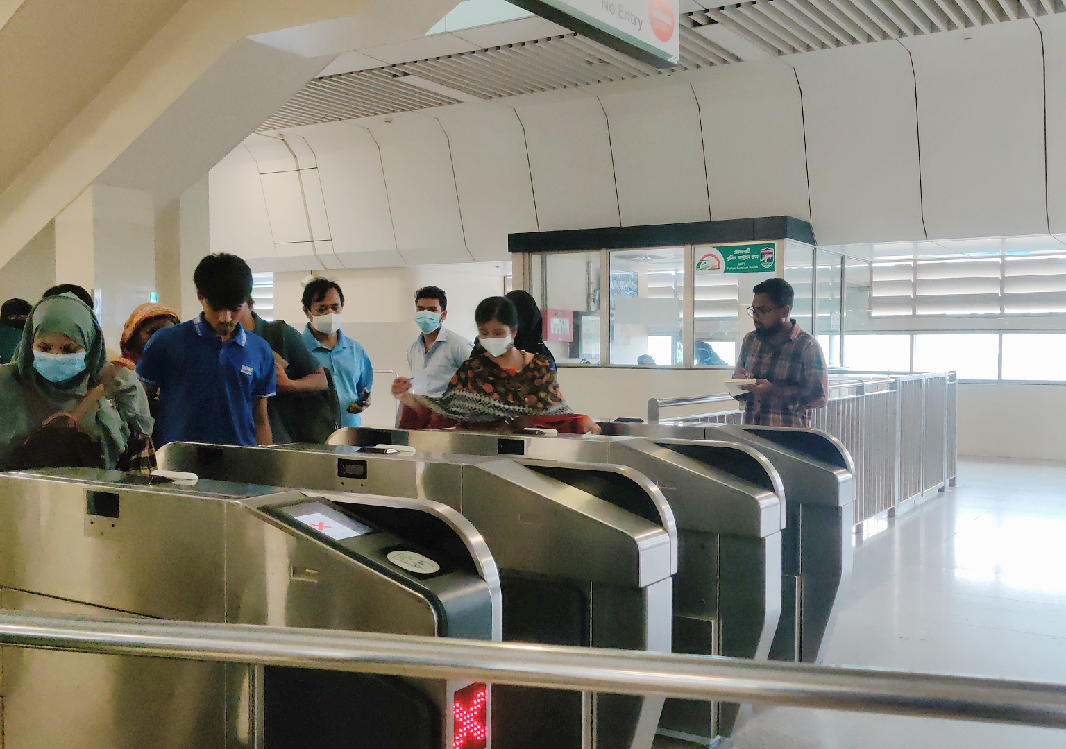
No Way to Check Balance
Users often arrived at the gate unsure whether they had enough money to board. Some missed their trains because they didn’t know until it was too late.
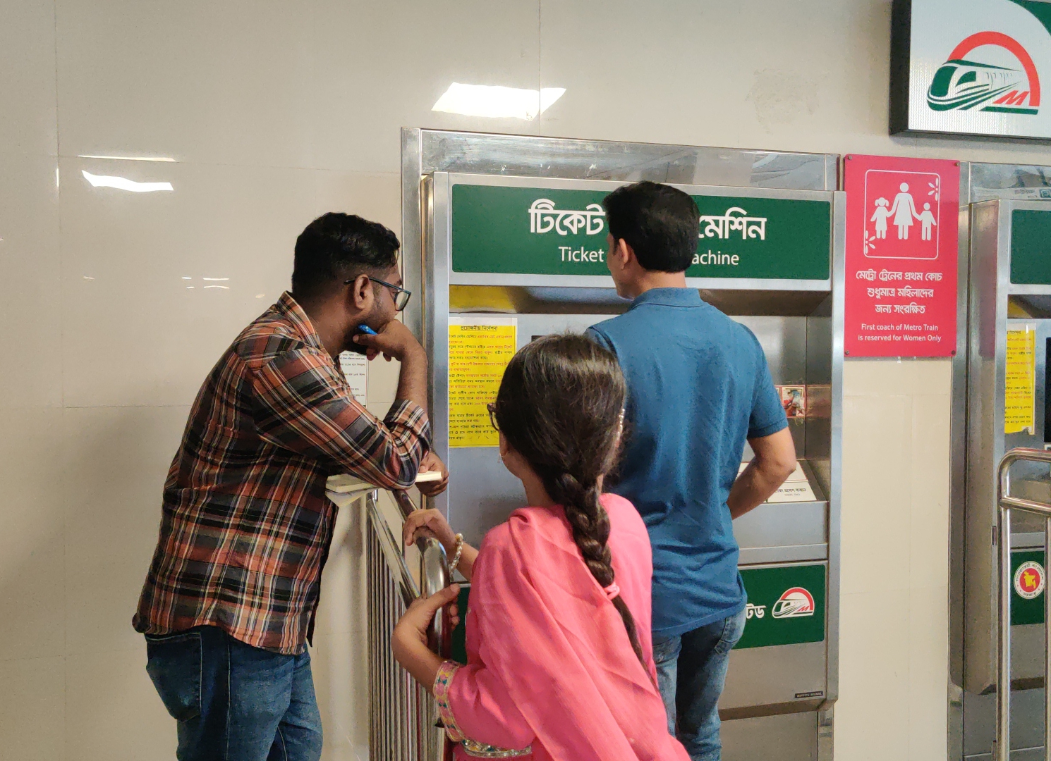
Manual, Frustrating Recharge Process
The only way to top up your card was to wait in line at the ticket counter or at the ticket machine which was more confusing for the majority of users. no digital option, no quick scan, no retry when you're in a hurry.
Lack of Information and Feedback
Commuters didn’t know their recent trips, how much they were spending, or if they were about to run out of balance. There was no app to guide them.
A Smart System with a Missing Piece
The metro infrastructure was modern. The trains were fast. But the user experience? It was disconnected. Smart transport with no smart app.
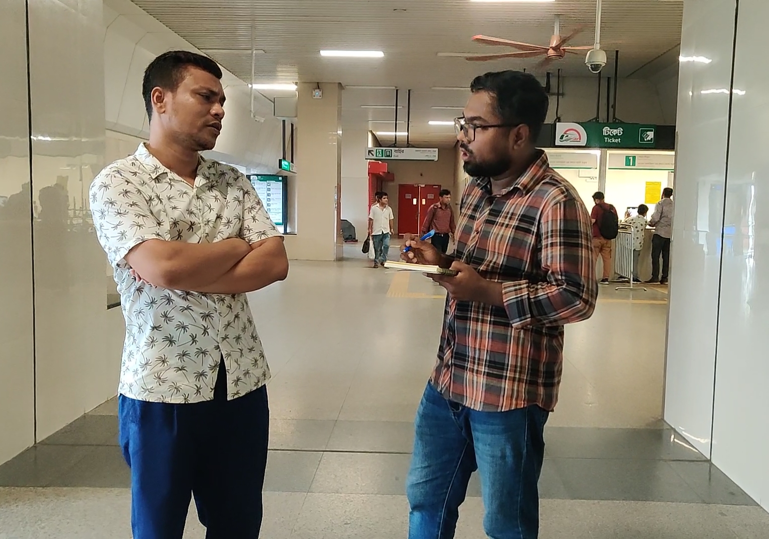
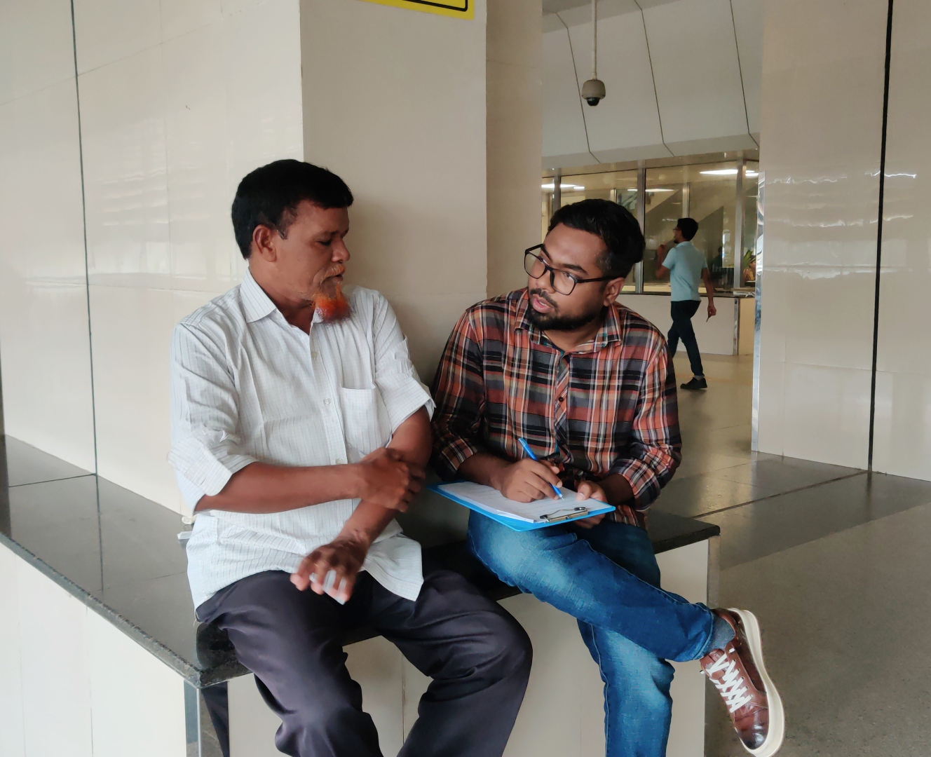
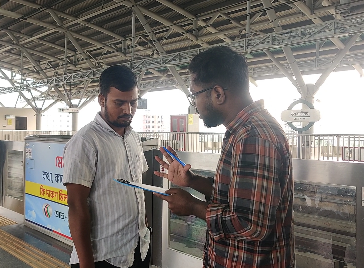
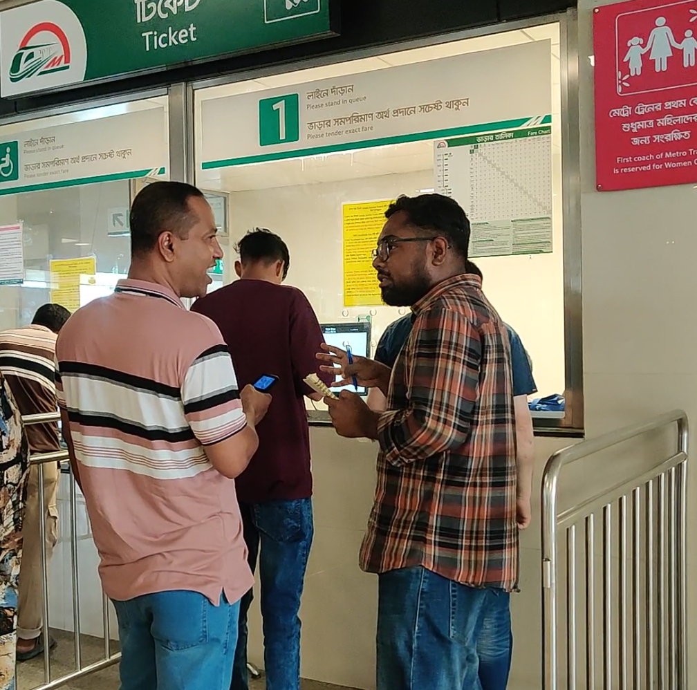
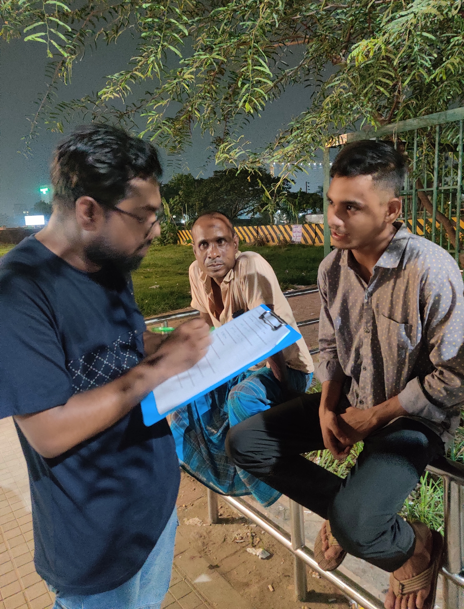
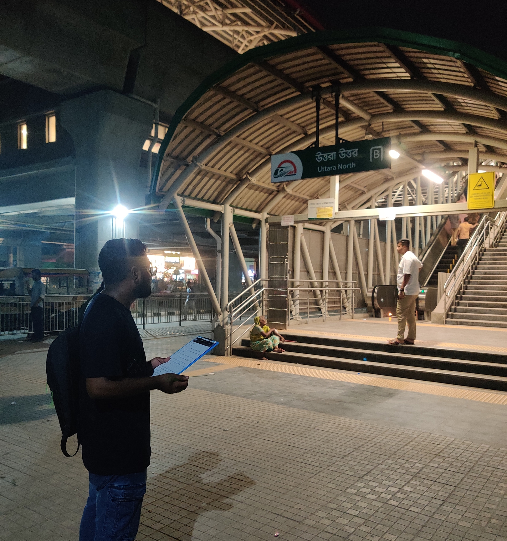
Talking to Real Commuters
I visited metro stations, recharge counters, and waited in queues just like the commuters I was designing for. I interviewed 13 real users from all walks of life. Their words and behaviors became the foundation of this app.
👩🦳 Sanama, 24
Student | Somewhat Tech-Savvy
“I never know if my balance is enough. I’ve missed trains because of the long lines just to recharge my MRT card.”
🧑 Md Zakaria, 51
Businessman | Non-technical
“I’m scared to use machines. I do not understand the interface. Too much complexity.”
👨💼 Engr Akter Hossain, 27
Office Goer | Tech-Savvy
“I wish there was an app to recharge my MRT card. I also want monthly travel cost breakdown to track my expenses.”
These face-to-face moments made the biggest impact on my design decisions. They reminded me that the best apps aren’t built behind a screen. They’re built in the field.
What I Set Out to Solve
Based on real user pain points, I defined key experience goals to drive the entire design process from wireframes to interactions.
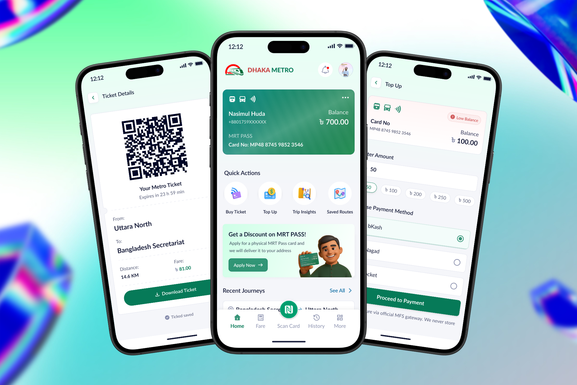
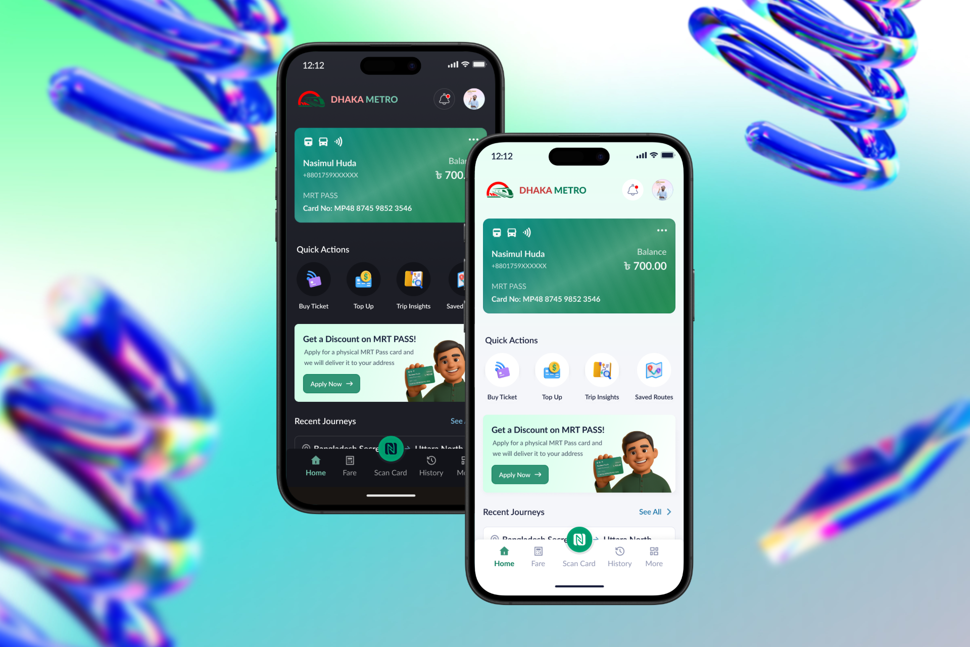
🔎 Instant Card Visibility
Users should see their balance, recent trips, and card status at a glance without digging through menus.
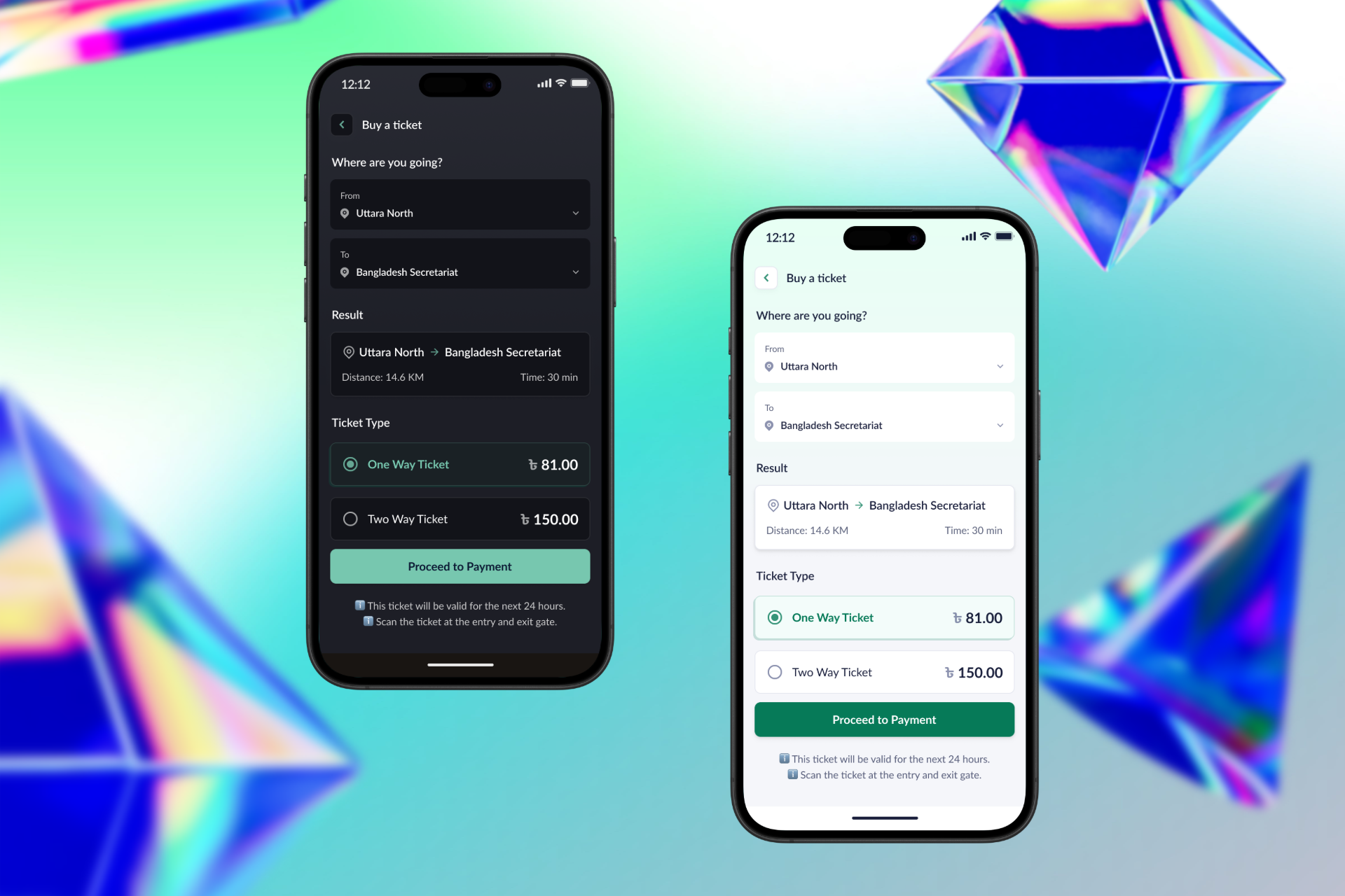
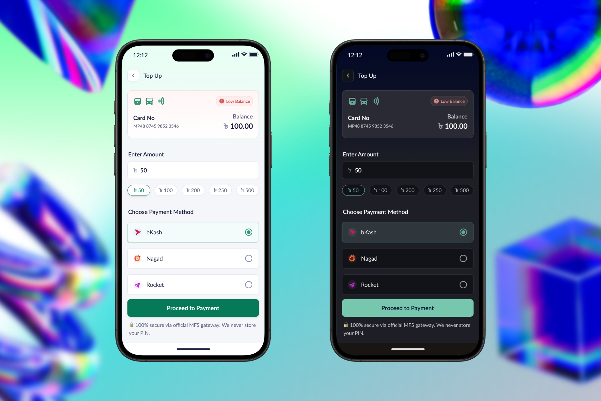
💳 Seamless Top-Up
Recharge your metro card through bKash, Nagad, Rocket in seconds, without standing in line.
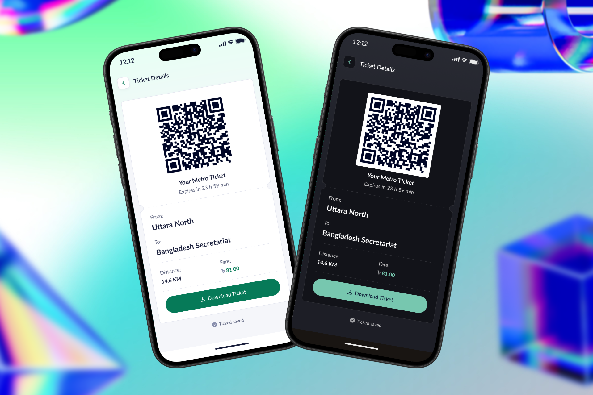
🎟 Digital Ticketing
Buy a one-time ticket with fare breakdown, QR preview, and NFC scan designed for both tech-savvy and first-time users.
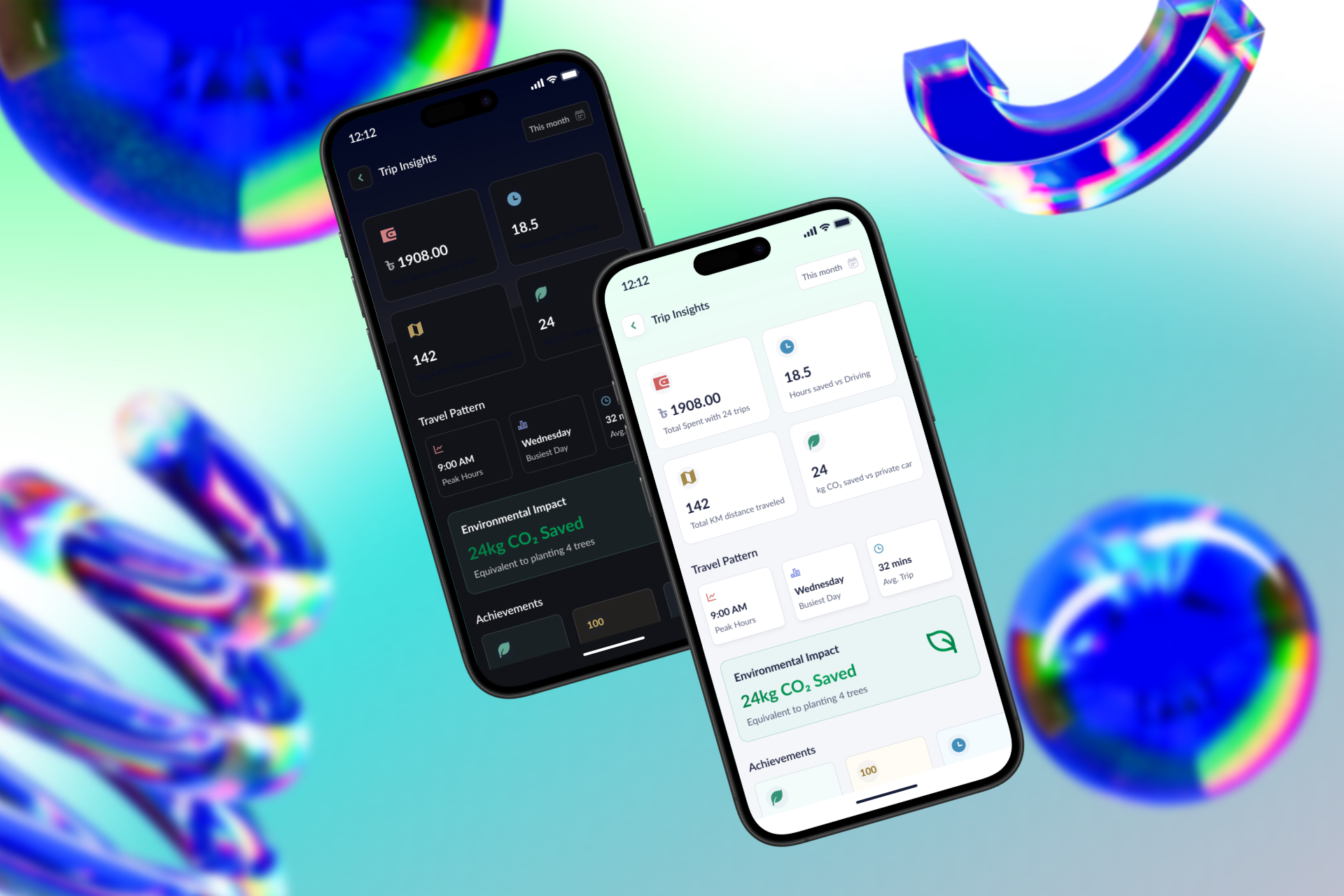
📊 Trip Insights & Smart Reminders
Users should know how often they travel, where their money goes, and when to recharge. All in one screen.
I wanted the experience to feel as fast, quiet, and reliable as the metro itself.
What Real Users Told Me
I conducted in-person interviews with 13 metro commuters students, professionals, office goers, and one-time ticket users to uncover real frustrations and unmet needs within the current metro experience.
🔍 Research Snapshot
- 13 face-to-face interviews
- Ages 20–55, mixed gender & background
- MRT Pass users and one-time ticket users
- Conducted at 3 metro stations in Dhaka
📊 Key Findings
- 10 users can’t easily check their balance
- 9 missed trains due to long lines at the ticket counters
- 11 want to recharge via mobile apps
- 2 prefer QR/NFC entry via app for one-time tickets
💬 Real Voices
“Sometimes I don’t know if my card has money until it’s too late.”
– Rafiq, 41
“I always ask my son to recharge it. I don’t know how to do it myself.”
– Sumi, 34
“If the app showed my trip and cost, I could plan better.”
– Arefin, 27
“I don’t trust the machine. I always go to the counter, even if there’s a line.”
– One-time ticket user
These conversations made it clear. The need isn’t just digital… it’s deeply human. People want clarity, control, and confidence with every ride.
📊 User Research Data
Insights from 13 real metro users in Dhaka across different ages, tech comfort levels, and travel habits.
📈 Quantitative Overview
- 77% (10/13) can’t check balance easily
- 69% (9/13) missed trains due to long line issues
- 85% (11/13) want bKash/Nagad top-up
- 38% (5/13) use one-time tickets, avoid ticket machines
- 15% (2/13) prefer QR/NFC scanning
- 62% (8/13) want trip + fare tracking
👥 User Segments
- Students – 4 users
- Office Workers – 5 users
- Homemakers – 2 users
- Seniors – 2 users
📶 Tech Comfort Level
- Tech-Savvy – 6
- Somewhat Savvy – 5
- Non-Technical – 2
🎯 Top Feature Requests
- Card balance visibility on home screen
- Easy top-up via mobile financial apps
- Digital ticket (QR + NFC support)
- View past rides and spending history
⚠️ Key Frustration Themes
- No idea of card balance until rejected at gate
- Long queue at ticket counters
- Confusion using touchscreen machines
- No awareness of monthly transport costs
These numbers tell one story that people want confidence and control in every metro ride. Good design isn't just a feature, it's how we connect users to what they need, instantly.
Solving the Queue Problem With One Tap
Users without an MRT Pass faced the most friction. They avoided ticket machines and queued at manual counters. My solution? A digital ticket system so simple, anyone can use it.
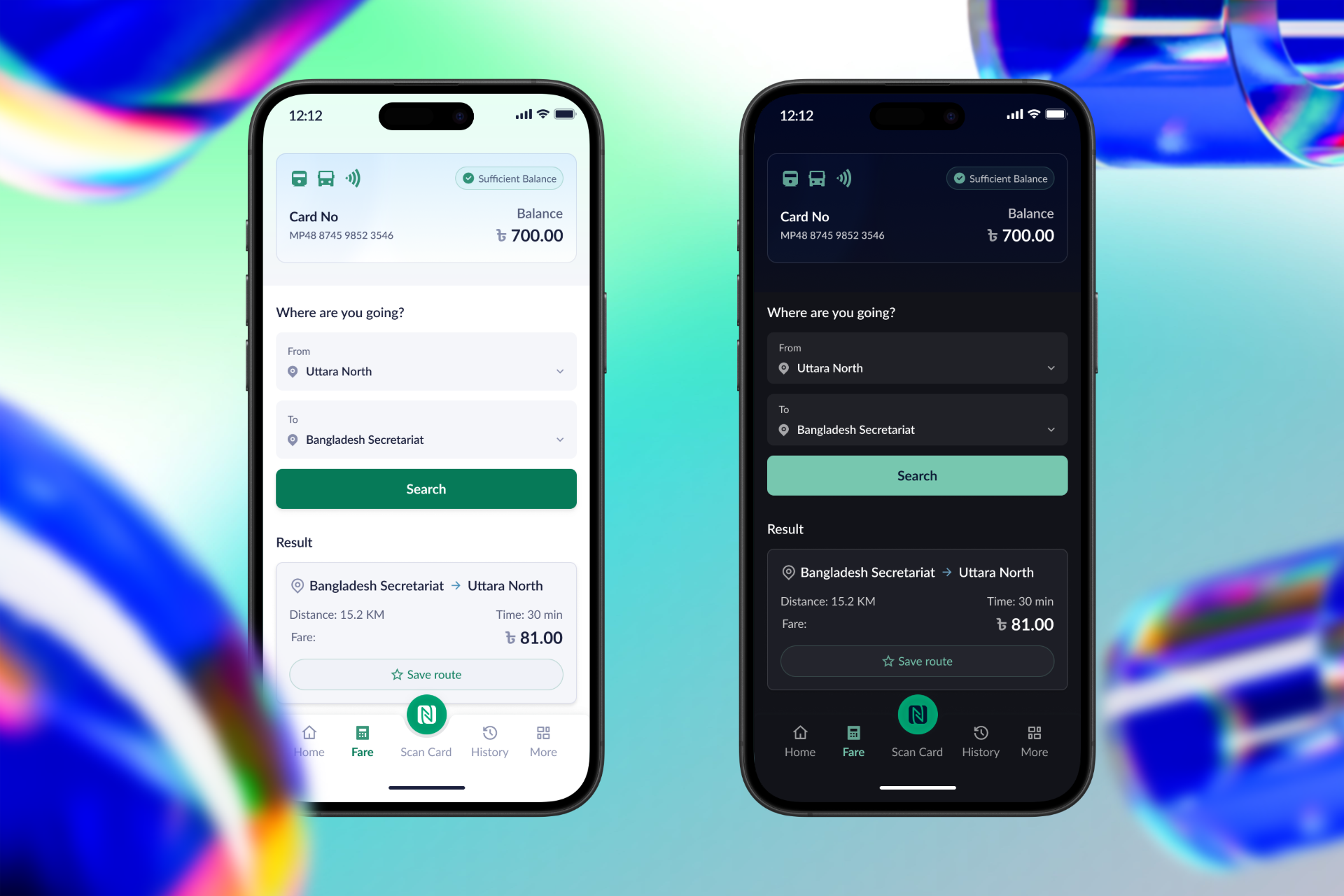
🎫 1. Buy Ticket in Seconds
- Choose From → To stations
- View fare, time, distance instantly
- Pay with bKash, Nagad, Rocket
- Instant QR ticket appears on-screen
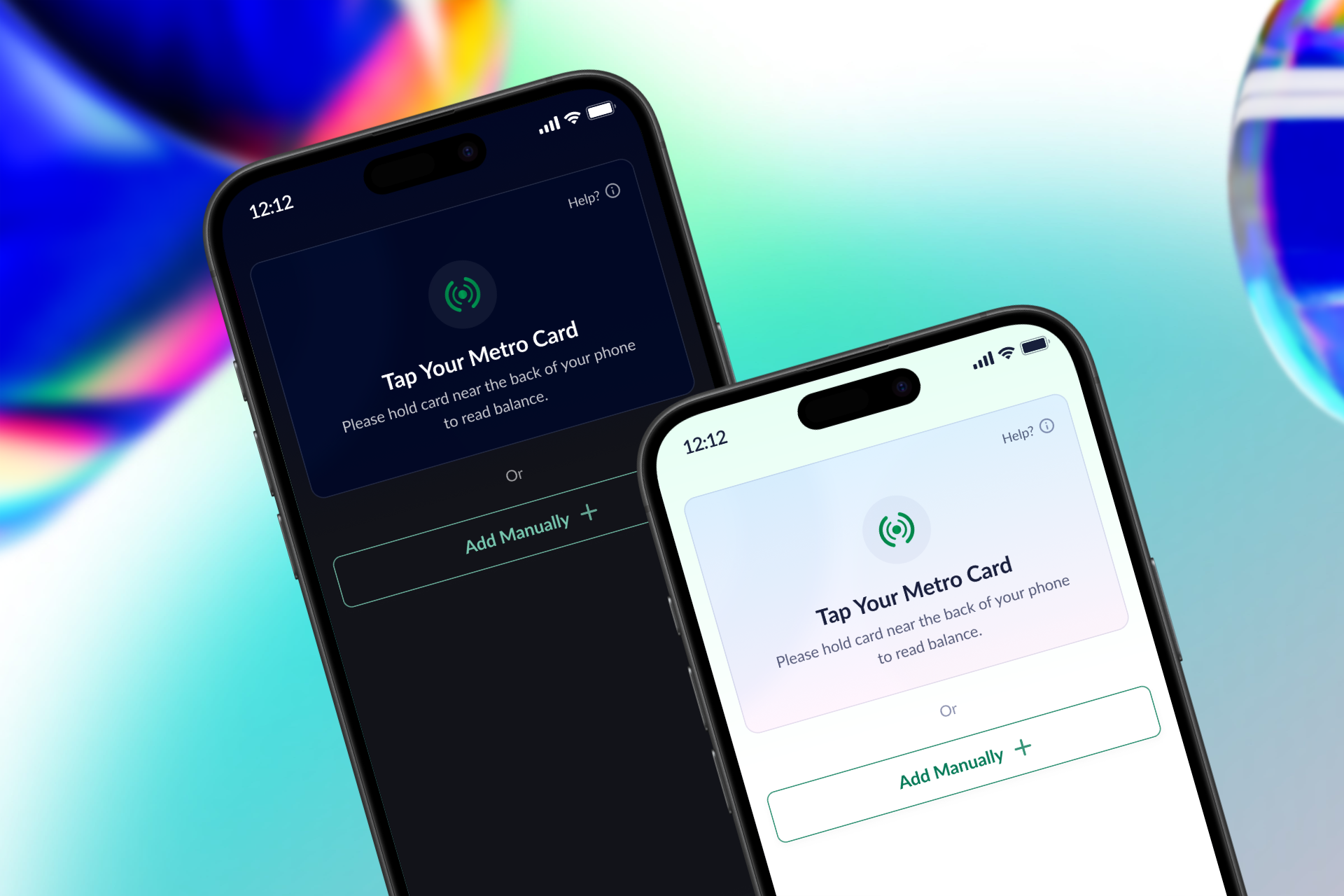
📲 2. Tap Phone or Scan QR to Enter
- Skip queues and machines
- Use your phone’s NFC to tap at gate
- Scan QR code to enter the station
- No physical card needed
💳 3. Top Up MRT Pass
- Recharge your metro card anytime
- Use bKash, Nagad, or Rocket
- No more waiting in line
- Instant balance update
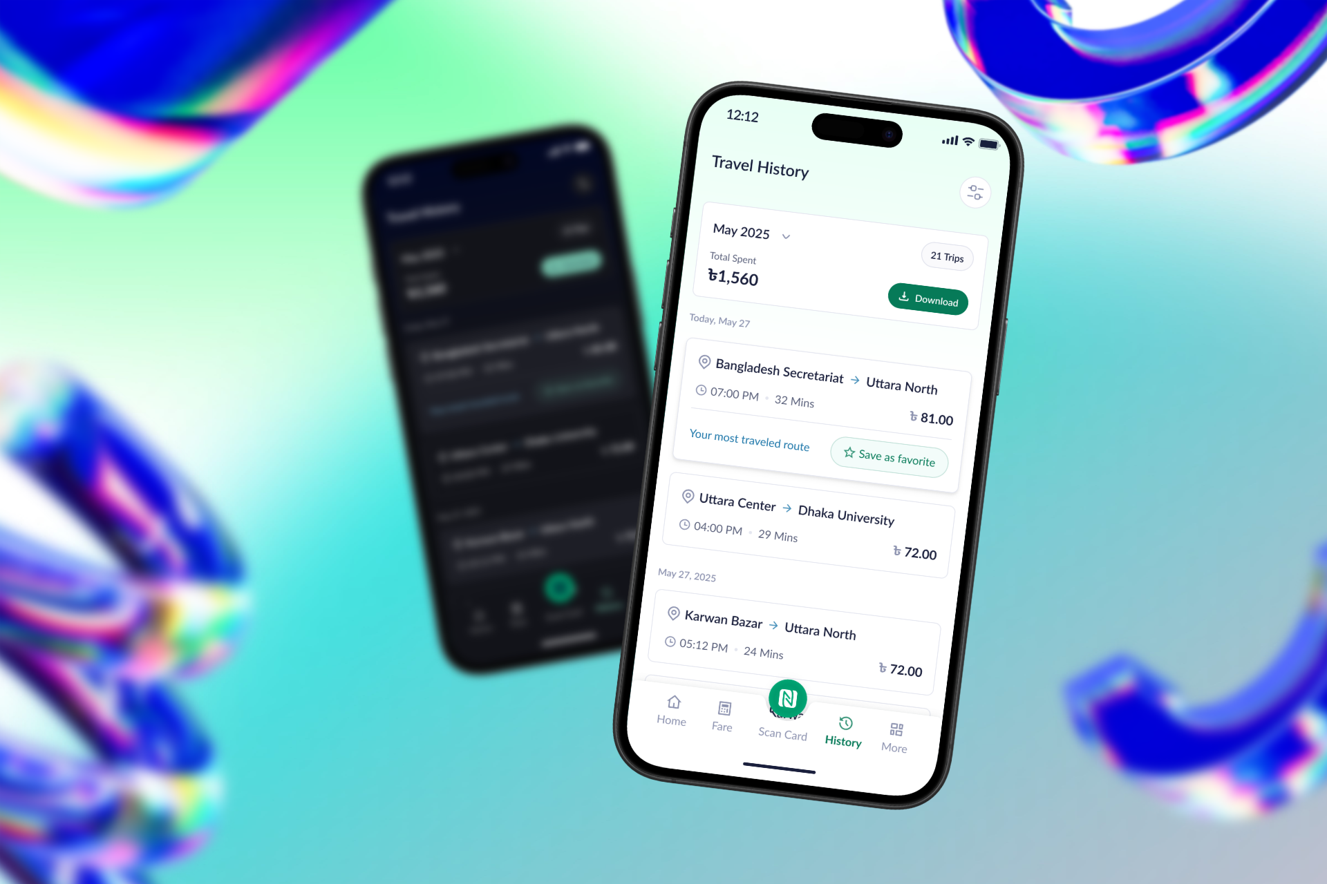
📊 4. Trip Insights
- See your travel history
- Fare breakdown for each trip
- Monthly spending at a glance
- Helps you plan and budget
With the app, users don’t need a plastic pass or confusing interaction with the ticket machine, just a phone, a scan, and they’re on their way.
What I Learned Along the Journey
This wasn’t just a design challenge, it was a human one. Talking to real people, walking through the chaos of a metro station, and designing from the ground up taught me lessons that go far beyond pixels.
🧠 Empathy Before Interface
Real design begins with listening. The problems people shared weren’t always what I expected and that made them even more important.
🔁 Iterate with Intention
From sketches to screens, I reworked every feature based on insights. The result wasn't perfect but it was purposeful.
🚇 Design is Infrastructure
Good systems don’t just move people, they respect them. This app isn’t just about convenience. It’s about dignity in motion.
I started this project with curiosity and ended with conviction: thoughtful design can move a city forward.
Watch the Video
Get a quick look at how the design works and why users love it.
📱 Interactive Prototype
A live Figma prototype designed for metro users that was tested, and refined through real feedback.