This research is conducted independently and is not endorsed or sponsored by bKash. It represents an individual effort aimed at improving the user experience of the bKash mobile app based on user insights and feedback.
Duration
2 months
My Role
User Research, Empathy Mapping, User Persona,
Problem Solution, Visual Design, Usability Testing
Team Size
Just Me
The bKash mobile app, which is widely used in Bangladesh for financial transactions, is facing some important issues that are causing frustration for users. People are accidentally sending money to the wrong recipients, and this is making it difficult for them to use the app with confidence. Moreover, the app lacks a clear and helpful dashboard where users can see an overview of their financial activities. It also needs a send money request screen to make transactions smoother and less prone to errors.
Users report instances of accidentally sending money to the wrong recipient due to unclear UI elements, causing frustration and the need for improved recipient verification.
Users find it challenging to quickly access an overview of their financial activities, including money added, withdrawals, and bill payments.
Users face challenges when they need to request money from friends, family, or business associates using the bKash app. Currently, there is no built-in feature that allows users to send formal money requests to others.
Users struggle to keep track of their transactions within the app, leading to potential confusion and concerns about financial management.
These problems are affecting user satisfaction and trust in the app. It's essential to address these issues in a user-friendly way to make the bKash app more enjoyable and efficient for its users.
I redesigned the bKash interface with a focus on simplicity, personalization, and clear value demonstration. I also focused on improving the user experience, preventing accidental transactions, and creating a user-friendly dashboard and send money request screen that align with what users expect and need.
Enhance the user interface by displaying recipient names, profile pictures, and other relevant information during the money transfer process for user verification. Include tag like "Agent" and "Personal" for Clearity.
Developed a user-centric dashboard that provides an overview of key financial transactions, including money added, withdrawals, bills paid, and more.
Design the send and receive money request screen to streamline the process and make it more intuitive for users.
Introduce visual differentiation, such as color-coded buttons, icons, and labels, to make it clear which action users are taking.
I followed a user-centered design process to ensure that the final product would meet user needs while achieving business goals.
Conduct Secondary User Research, Identify Pain Points
UX Personas, Empathy Map, User Journey Map, Wireframing
Visual Design
Prototype
Feedback Collect
Test
Retest
Finalize
Sarah Ahmed
Date of Birth: May 10, 1994
Age: 28 Years old
Profession: Office Worker
Location: Dhaka, Bangladesh
Sarah is an office worker in Dhaka, Bangladesh, who relies on the bKash app for various financial transactions. She is responsible for managing her monthly bills, sending money to family members, and occasionally receiving funds from friends.
Sarah's primary goal is to efficiently manage her finances using the bKash app. Her meticulous and organized nature drives her desire to ensure that all her utility bills are paid on time, and her financial transactions are well-organized.
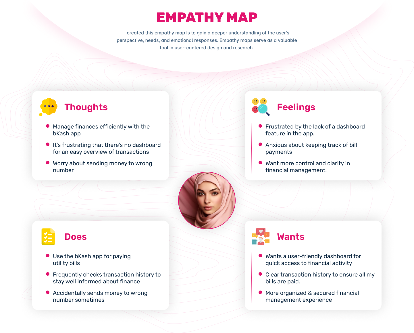
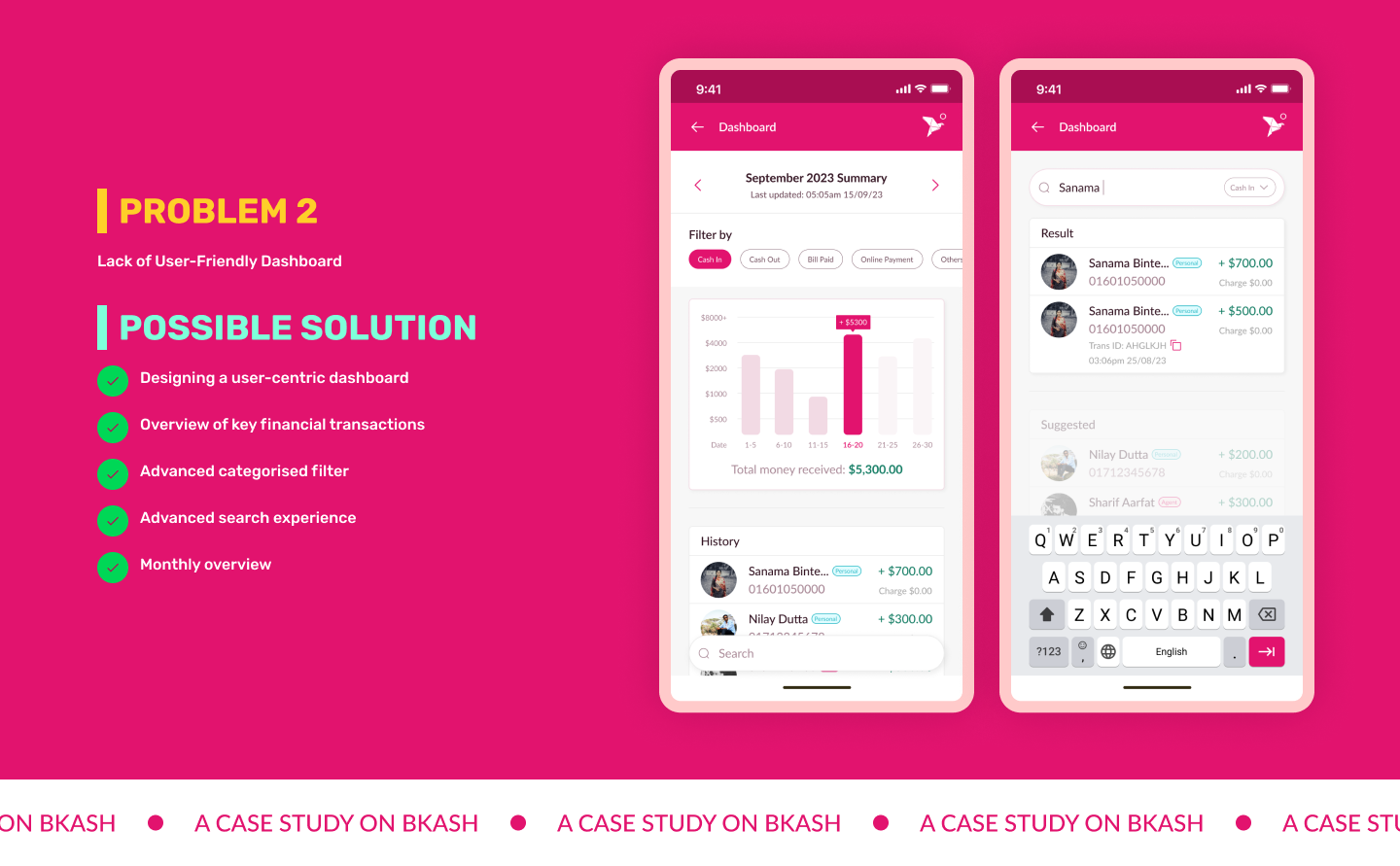
Sarah's meticulous and detail-oriented personality often clashes with the absence of a dashboard feature in the app. This limitation frustrates her as it hinders her ability to quickly access a clear overview of her financial activities. She wishes for a user-friendly dashboard to simplify tracking her transactions and account balances.
Get a quick look at how the design works and why users love it.
Through my research on the bKash app, I've learned some important things that are really helpful for my work as a UI/UX Product Designer. First and foremost, it's super important to keep the users in mind when designing. I talked to users to find out what they like, what's hard for them, and what they need. This info helped me create user profiles, which then guided how I designed things. I also realized that it's a good idea to keep improving and refining the design as I go along.
I've learned to really understand and empathize with the things that frustrate users, like making mistakes when sending money, and to design solutions that make things easier for them. These lessons are helping me not just with this project but also in growing as a UI/Product Designer (UI/UX), making sure that what I create is all about making users happy.