
Why Accessibility Matters
Globally, over a billion people live with disabilities. That's 1 in 7 users. Designing without accessibility in mind means excluding a huge portion of users—and it also often degrades the experience for everyone else.
Design Beyond Color: Supporting Users with Color Blindness
Color blindness primarily affects men and can come in different forms. The most common type—red-green color blindness—makes it difficult to distinguish between those colors. Some individuals may even perceive no color at all.
Let's say your form uses red to indicate an error. If a user can't perceive red, they may never realize something is wrong. That's why it's critical to never use color alone to convey meaning. Instead, use icons, text, and shape to reinforce color cues.
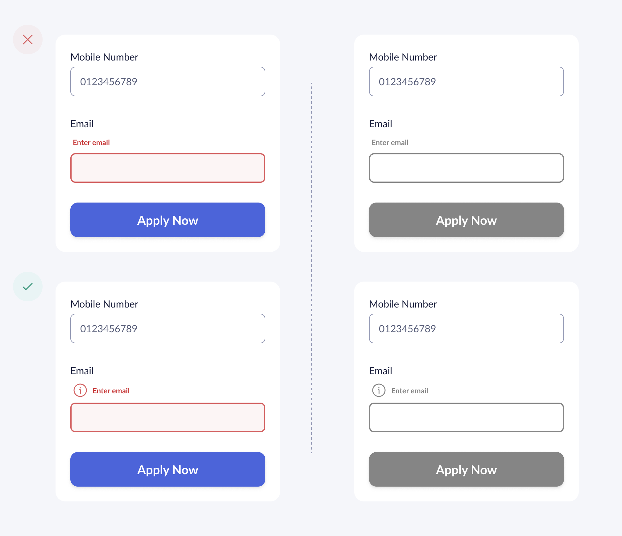
Inaccessible Example
This field only changes border color. It's not enough for color-blind users.
Accessible Example
This version uses multiple cues—making it clear to all users.
Please enter a valid email address.
Key Accessibility Principles
Color Contrast
Ensure sufficient contrast between text and background colors for readability.
Keyboard Navigation
All interactive elements should be accessible via keyboard navigation.
Text Scaling
Design should remain functional when text is scaled up to 200%.
Alt Text
Provide descriptive alt text for all images and non-text content.
Ready to Make Your Designs Accessible?
Start implementing these principles in your next project and create experiences that work for everyone.